how to create your own website

Design Strategy

Redesigning an outstanding e-commerce platfomr experience through rich storytelling, clean design, and proven human psychology. 

For many consumers looking for unique products, [e-commerce platform] comes top of mind. One of its key differentiaters is the direct connection of buyers with local designers and craftsman. However, when talking to users, one of the problems often mentioned when purchasing customized goods is that the communication between buyers and sellers is not always clear and consistent. My team was on the journey to help [e-commerce platform] improve the way its users sell and buy custom items.

User Research

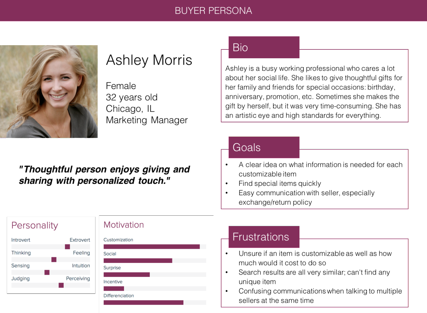
To begin the process of improving on [e-commerce platform]’s mobile experience, I looked into the current mobile app user profiles and found that typical users tend to be below 45 years old, bachelor degree, with 67% of the buyers and 86% of sellers being female.

In order to identify potential participants for our user interviews, we created and sent out a screener to find people who were familiar with the [e-commerce platform] desktop and/or mobile platform, use [e-commerce platform] at least monthly or more, and have bought a customizable on [e-commerce platform] at least once. A total of 76 people responded to the screener and the results provided us with 45 qualified individuals, and confirmed interview with 12 participants total .

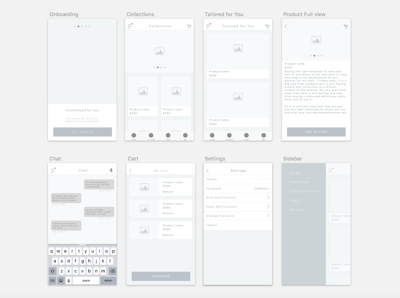
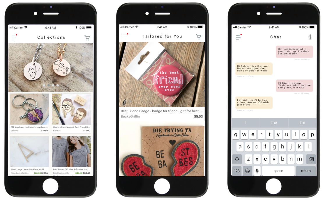
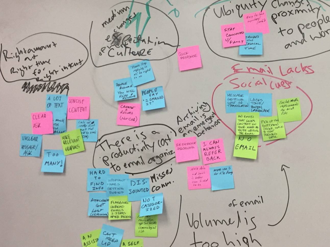
I led two junior researchers to conduct the interviews. To ensure consistancy, I created an interview script, which was broken down into general questions, buyer specific questions, and seller specific questions. Lots of data were shared about the [e-commerce platform] and the overall experience were positive. But a few of the interviewees did note that buying customized items on [e-commerce platform] was not always the most intuitive.

Synthesis + Describe

My team combined reports and began synthesizing the data collected from the 12 interviews. We wrote each item onto their own sticky note, and using affinity diagramming to cluster the notes into four categories — behaviors, likes, dislikes, and quotes. Using the themes that emerged within the clusters, my team created statements that would represent the users during the remainder of the project.

Using all of the user interview synthesis, user statements, and demographic data we studied on [e-commerce platform], we created two personas that we would design for. These personas included one for the buyer — Ashley, the “thoughtful person enjoys giving and sharing with personalized touch” — and one for the seller — Gabi, the “creative artist looking for extra income.” We use these personas as a north star throughout the design stages to keep our users top of mind.

Next, we used personas to map the customer journey to describe each persona’s experience at various touch points during their lifecycle with the [e-commerce platform]. We identified pain points where we need to make improvements as well as where opportunities exist for better engagement.

Reframing

We noticed many of the statements from both buyers and sellers related or even overlapped. These were the aspects that we should focus on most since they would cater to both the buyer and the seller. The overlapping statements were:

• I enjoy connecting directly with the creators (or buyers).

• I wish the purchasing process was more standardized.

• I want to be able to find an item quickly (or a buyer to find my items quickly).

• I expect a prompt response and clear notifications.

By combining the original proposed problem with the synthesis of our user interview data and user statements, we reframed the ask to better respond to the challengs that the [e-commerce platform]’s current platform is facing.

- Original Proposed Problem: While currently buyers can communicate their customizations with sellers via messaging, buyers don’t always know how to identify these items and what to expect when purchasing them. Also, it is time consuming for sellers to handle a diverse range of requests.

- New Problem Statement: How might we bridge the gap of communicaiton about customization and manage expectations from both buyers and sellers?

Ideate

From the data synthesis, it was clear that current [e-commerce platform] both buyers and sellers were focused on two things — a more standardized purchasing process when buying customizable items and more prompt responses and clear notifications when messaging other buyers or sellers.

We started by defining design principles that would help solve the problem statement:

1. Find customizable products and options quickly

2. Make the inputs for customized details clear and concise

3. Turnaround time communicated clearly

4. Streamlined and transparent communication between buyer and seller

These four design principles were used as inputs to operate on Creative Matrix, a brainstorming exercise used to organize and ideas from every team member. In a workshop together with 4 people from the client side, we developed hundreds of ideas such as standard onboarding, using machine learning to provide personalized recommendations, incorporating a virtual assistant to filter the early-stage questions such as options for customization, limitations, etc. As a group, we voted ideas that were considered important and feasible, and move to the next step to prioritize the features.

Prioritize + Plan

We used Importance/Difficulty matrix to prioritize the 15 selected ideas into a product roadmap. This methodology helped us rank the relevant importancy among all the important features and think realistically by ranking how difficult (feasibiltiy, cost, etc) to make it happen. A roadmap was created by prioritizing phase 1: high importance/low difficuly and phase 2: mid importance/mid difficulty + low importance/low difficulty, and consider low importance/high difficulty items as "nice to have" but not included in our project scope.

A project plan was created and included two phases consisting of six two-week sprints, following design - prototype - test iteration cycles.

Design + Prototype + Test

Partnered with interaction designers, we created the first round of digital mid-fidelity wireframes and two user flows -  one for the buyer and one for the seller - to test and gather initial feedback. Incorporating the user feedback, we moved digital wireframes into InVision to create a high-fidelity prototype simulating a functioning product that was similar to [e-commerce platform]’s current platform but with our new features integrated. The new screens included a "Tailored for You" section where users could answer few questions (e.g. customizable) and browse filtered items. They can initiate a chat with the seller to have a more detailed conversation.

I partnered with client's BI team to conduct a round of A/B testing to optimize design effectiveness. One pitfall that lots of designers made was relying on the clickthrough rate to validate whether a design change is effective. However, wearing my business strategy hat, what I care is the impact on the business: the conversion rate.
- Goal: Improved conversion rate on customizable items under Tailored for You section
- Hypothesis: Adding a chat button on the product page can trigger more conversations and thus improve the conversion rate (adding products to the shopping cart).
- Test variations: Group A (300 visitors) sees the product page without a chat button, and group B (300 visitors) sees the page with a chat button.
- Experiment and results: Among Group A, only 12 people had added a product to the shopping cart, whereas 35 people from Group B had added a product to the shopping cart. With 95% confidence level, we concluded that the test result was statistically significant and thus added a chat button onto the product page.

In each sprint, I conducted usability tests with seven participants. Using a script with set scenarios and tasks as a guideline, I recorded the screen for each usability test while taking detailed notes of exactly where the user is clicking and what they are thinking as they complete the tasks. I always asked two open ended questions: "What is missing?" and "If you can change anything, what would you change?" I believe some of the most valuable information to be found as they would give extra thoughts that we as the testers may not have thought about asking.

MVP + Moving Forward

Four months passed by quickly, and we were able to deliver a functional MVP to the client for further developmment. Time for development was significantly shortened from traditionally six to eight months to only four months. Furhtermore, the user research report became the guidelines for client's product teams, and the co-created product roadmap was incorporated into future development plans.